

Primer
Primer
An orientation before you jump into the team-by-team analysis
What should you expect?
Each team write-up follows the same template. There are four headings:
· What happened last season?
· What happened in the offseason?
· What will happen this season?
· The projection
I’ll state here that I’m not interested in defining why I use certain metrics and I’ll spare detailed methodology. There are other places you can read about Pythagorean wins and real plus-minus (RPM) and the like.
What happened last season?
Maya Angelou, probably not reflecting on gambling, once said, “You can’t really know where you are going until you know where you have been.” A team’s previous season’s performance helps set the expectation for the upcoming season’s performance not just for the fanbase but for the oddsmakers too.
We start each section with this table. We’ve pulled the Toronto Raptors’ table for this example.
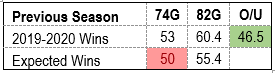
We glean:
· How many games the team won the previous season and what their “expected” wins were based on point differential. The difference is important: most fans’ judgment of the team’s previous season performance is based on the actual win total, but point differential is a better indicator of team performance. The expected win total for the Raptors was less than their actual wins accumulated, so we’ve highlighted that cell red. Let’s state the obvious here: red = bad or under, green = good or over.
· What the prorated actual and expected wins for a full season were. Uniquely, each team played a different number of games last year and it’s easier to comprehend the win total based on a full 82-game season.
· How the team performed against their season win total line. Narratives of overachieving or underachieving again influence a fan’s judgement of previous season performance.
We then summarize the team’s previous season. What where their expectations and did they meet them? Did any particular player surprise or disappoint? Were there any significant injuries? What were the in-season transactions?
A helpful guide to how a team performed is a simple one: who actually took the floor? Let’s use the Brooklyn Nets as an example.

Here’s how to interpret the color scheme:
· The dark green shading (Joe Harris) indicates that the player played for the team in the previous season (incumbent) and played within range of (or exceeded) their preseason expected minutes (based on our approximation).
· The light green shading (Taurean Prince) indicates that the player was acquired prior to the start of the season and played within range of their expected minutes.
· The yellow shading (Chris Chiozza) indicates that the player was acquired midseason.
· The light red shading (Kyrie Irving) indicates that the player fell short of their preseason expected minutes, most likely due to injury.
· The dark red shading (Iman Shumpert) indicates that the player is waived or traded from the team midseason.
We may briefly discuss playoff performance, but we’re here to prognosticate regular season results. Past regular season performance correlates more to future regular season performance than past playoff performance does. And it’s better for us when they don’t correlate: playoff performance (say it with me) influences a fan’s judgement of future team performance. It is helpful to our cause when perception is misleading.
What happened in the offseason?
We begin this section with a simple ledger of who have come and gone. Here’s what the Portland Trail Blazers did during this year’s short free agency window.
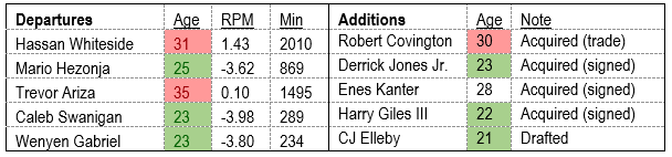
The outgoing player’s previous season age, RPM, and total minutes played is reported. In Trevor Ariza’s case, his total minutes came from two teams, but the RPM available to us is a full-season metric. Ariza’s minutes contribution to the Trail Blazers can be looked up in the previous section. The incoming player’s age and method of addition is provided.
We briefly discuss the past contributions of the outgoing players and the anticipated roles of the incoming players.
What will happen this season?
We’re getting close now. This section begins with the Projected Depth Chart and Minutes Contribution table. Let’s use the Denver Nuggets for this one.

Let’s step through this depth chart column by column.
The player’s names are grouped by position and ordered according to (our) projected starting lineup and rotation. Player names in bold indicate that the player is a new member to the team.
The player’s age is reported. Ages highlighted in green (26 and younger) indicate the player is in the ascendancy of their basketball caliber. Ages highlighted in red (29 and older) indicate the opposite. Players aged 27-28 are in their primes.
The player’s Projected Plus Minus (PPM) is provided. This number is our estimation of on court success for the upcoming season. It is based on multiple years of past RPMs weighted by minutes and recency, and adjusted for factors such as age and incumbency. For rookies, we blend available statistical projections. Typically, their plus/minus is negative.
The player’s projected minutes played is provided. This number is our estimation of time on court. We consider minutes played over recent previous seasons, a player’s injury history, current injuries, and role on the team.
The bottom right square offers up some information regarding continuity and sample size. It’s useful to know whether or not a coaching change was made. The Returning Minutes with Team represents the total minutes played in the previous season by the incumbents. Not only is continuity “good” but it can also strengthen our confidence in the projection (greater sample size). Speaking of sample size: the returning minutes with NBA tallies all player’s minutes logged last season. A team full of vets may have logged over 100% of last year’s available minutes per team. A team full of rookies with a significant projected role (think last year’s Atlanta Hawks) won’t.
One thing that should be noted: we’re all optimistic going into the season. Anyone that projected Steph Curry to play 139 minutes last season is a witch. It’s a zero-sum game, so over-expectations are adjusted across all teams.
We provide some narrative to discuss the depth chart and projections. Did team bring the band back together or go through an offseason overhaul? Is a team stacked with young players that are on the rise or can we expect the needle to start ticking toward Father Time’s half? How’s the depth of the team? Is a team relying on one or two players to meet its expectations or are contributions spread up and down the depth chart?
The projection
Finally. What does the bookie think and what does the “math” say? Let’s try the Hawks.

The win projection provided is our calculation based on the team’s expected point differential and adjusted for strength of schedule. (A West team projected to have a point differential of +2.0 is going to have a worse record than an East team projected with the same point differential.) Again, we provide an 82-game projection.
We justify or provide caveats to our calculated projected win total. Other things matter: continuity, motivation, draft assets in/out, sample size, to name a few. And straight up, some calculated player contribution numbers are suspect.
The calculated projected win total is not the conclusion. It provides us a more accurate baseline. Instead of guessing if the team will over or under the sports book’s win total, we guess whether or not the team will over or under our win total. If the math likes the team to go over the Vegas win total and we like the team to go over our win total, now we’re really in business.
Finally, we provide our intended or actual bet.
*
If, after 2,200 words of preamble, you’re now interested in reading an article about why we think that your favorite team is going to hit their over again, we’ve done our job. And we think that a lot of other readers will be interested in that as well.
